

ERA is such a great stat. It’s one of the earliest we learn when we are first absorbing the overwhelming power of numbers in baseball. It’s right up there with batting average and home runs as the most basic pieces needed to understand the game.
What’s nice is the math isn’t too tough, even if you can’t remember the formula, you remember its earned runs, innings pitched and 9 for the number of innings in a game. Do I multiply by 9 and divide by… it doesn’t matter what the math is. You can totally understand what the number means without fundamentally understanding the math. An ERA of 3 means he’d give up 3 runs in a full game, no sweat!
[button url=’#’ size=’small’ style=’blue’] But There’s More [/button]
The other thing that ERA does so well is show just how much light advanced stats have shed on baseball. I don’t know if people are calling it the statistical revolution, but that seems appropriate. The reason ERA is so great? Check this chart out:
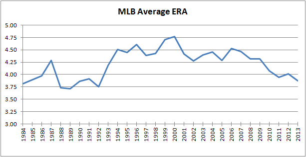
That’s the average ERA for all of MLB, each of the last 30 years. It’s pretty darn volatile, fluctuating between 3.71 in 1989 and 4.77 in 2000. That’s over a full run difference in what’s league average. Think about that for a second. After all, if you can throw 200 innings and have around a league average ERA, you’re a solid 4th starter. Jason Vargas just signed a 4 year, $8 M per season deal to do just that. How do I know he’s league average? Well, he’s actually just a tick below, but we’ll get to that.
First, let’s take a look at that chart again. The overall trends reflect many things. For example, the increase in the mid-90s reflect the increased use of PEDs, and that blip in 1987 indicates that the Twins were all kind of roided out. Same thing for the Cardinals in 2006, obviously.
Alright, so I’m being a bit facetious here. But statistical noise aside, there was a general (and large) increase in 1993 that pretty much sustained itself for a dozen years. Many think that it’s a direct result of steroid use, and that may have had something to do with it, but there are plenty of possible explanations that shouldn’t be dismissed, and that’s not really what this is about anyway.
Of course, it is a bit what it’s about. Because all this is a long winded way of showing why ERA can be beautiful, but flawed. The great thing, the wonderful about it, though, is that’s it’s pretty easy to understand, and accept, just why it’s flawed. Which makes it, in a way, the gateway stat to sabrmetrics. If only there was a way to express the same idea as ERA but take into account the differences eras (lowercase, as in a period of time) can bring.
[button url=’#’ size=’small’ style=’blue’] ERA plus What? [/button]
That is where ERA+ comes in. It’s great for people learning about sabrmetrics because it’s relatively simple, for the most part. The formula: 100 * league average ERA / the pitcher’s ERA. Now, any ERA+ you would see is probably different than just that, because the differences in ballparks are taken into account. But, in essence, that lgERA/ERA is all that really needs to go into it. ERA+ has it’s own flaws, but it’s very good at eliminating some of the skewed historical perspective that ERA along cannot.
ERA+ shows us exactly how a pitcher stacks up against the rest of the league. 100 is league average. If a pitcher has an ERA+ of 115 it means the league average ERA was 15% higher (worse) than his. The math, once again, isn’t terribly important – it’s more about relationship to the 100 number. Higher is better, and significantly higher is even better.
Going back to the Jason Vargas example, we can tell he’s league average because over the last 4 seasons, his ERA+ has been 96. That’s very close to 100, albeit slightly below it. In more technical language, the league average ERA was 4% lower than his.
As for our original revelation of what ERA doesn’t do, ERA+ brings out the big differences in the years. Let’s take a look at two teams – the 1999 Yankees and the 2013 Nationals. In 1996, Orlando Hernandez had an ERA of 4.12, while 2013’s Gio Gonzalez had an ERA of 3.36. That’s a significant difference, the kind of number that you can feel. But ERA+ show’s the El Duque actually pitched better than Gio. Only slightly better, he had an ERA+ of 114, as opposed to Gio’s 113, but better nonetheless.
This kind of example is so important because it’s relatively easy to explain. El Duque pitched at a time that was tougher for pitchers – relative to the rest of the league, he had a better ERA+ than Gio did.
Going back to our hypothetical 100 ERA+ pitcher, in 1989 we’d expect his ERA to be 3.71, in 2000, we’d expect it to be 4.77. That’s a massive difference.
We can find some more interesting historical comparisons. In 1913, Walter Johnson had an ERA of 1.14, which lead the league. But it is kind of meaningless to me because that was the deadball era, and I don’t know HOW dead the ball was. Looking at his ERA+, though, it was 259, one of the best of all time. And if he was pitching in that same park, but using 2013’s MLB average ERA, that same ERA+ of 259 would have given him an ERA of 1.51 last season. So you begin start to realize how incredible his year was.
ERA, and ERA+, really serve to open your eyes as to what is flawed about some of the numbers we use, and how it is possible to make them, well, less flawed. They are the gateway stats to learning more about statistical analysis and baseball. And I, for one, hope they legalize them.