Last week, Frank Jackson at the Harball Times wrote an article chronicling the long-defunct Eastern Shore League. As a frequenter of the Delmarva peninsula, I have since been captivated by the idea of this league. If only I could go see some D league baseball when I was out there! And the thought of a minor league park in Rehoboth Beach just sounds incredible to me. My first thought was that it would be fun to put together a map of all the teams with their logos overlayed on top at their location. But a quick scouring of the whole entire internet leads me to believe none of these logos exist anymore.
So I made the map sans logos, and decided to make my own logos. If you follow the link above, you’ll see that some of these cities had multiple teams and mascots, so I picked a few that were appealing to me and went with em.
We’ll start with the map, and then go into the logos:
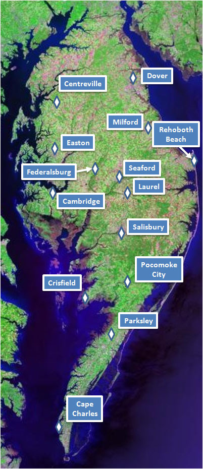
There you have it, all those teams within a couple hours drive of each other. But on to the real fun stuff, the logos. I take credit for the concepts, but much of the artwork comes from other logos I found.
Dover Senators
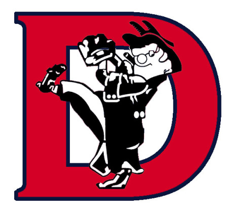
This is actually a Washington Senators logo from the 40s, put in front of a stylish Red and Blue “D”, for a different capital city.
Laurel Blue Hens
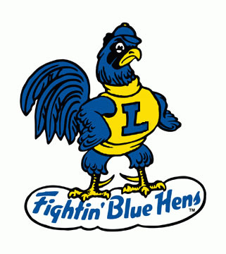
An old University of Delaware logo, but the Blue Hen was kind enough to put on a “L” shirt. I thought it was quite nice that he was wearing a baseball cap, although he doesn’t look thrilled about it.
Milford Sandpipers
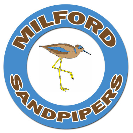
An original idea for this one, as there weren’t too many other Sandpiper teams to inspire me.
Rehoboth Beach Pirates
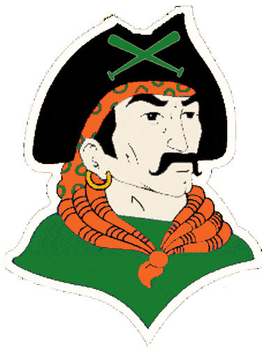
This is from an old Pittsburgh Pirates logo, one that was around at the same time as this team. Of course, some other colors seemed appropriate.
Seaford Eagles

Seaford was a Phillies affiliate, so with that name, I modeled the logo after the Philadelphia Eagles. And the color, of course, comes from the Phillies. This one was extra painful to make as it is basically a tribute to Philly.
Cambridge Canners
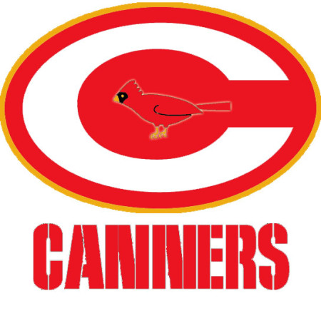
Thinking about what kind of logo would work for the Canners, I thought of another team with a similar mascot, the Green Bay Packers. So I converted the G and the PACKERS text logos. The Cambridge Canners were a St Louis Cardinals farm team, hence the colors and the 1940s era cardinal inside the C.
Centreville Colts
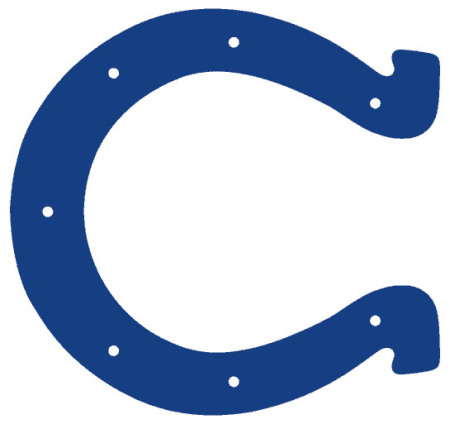
The old Baltimore Colts didn’t even put these on their helmets until the late 50s, and this team even predated their existence. But it seemed appropriate, especially after the alliterative C prompted me to turn it on its side.
Crisfield Crabbers

I debated whether I should use a crabber (someone who catches crabs) or the catch itself. Obviously I went with the catch, and the logo was inspired by modern logos such as the Twins and the Royals, with the script sitting on a baseball.
Easton Farmers
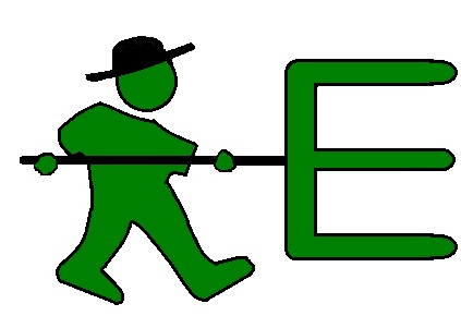
A farmer carrying a pitchfork shaped like an E for Easton. It seems like something that would be used on a logo to me.
Federalsburg Feds
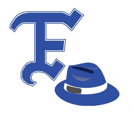
Federalsburg was an A’s affiliate for 8 years, and they were called the A’s. But in their 9th and final season, they were no longer affiliated, and switched names. It was only 1 out of 9 seasons, but it was definitely a better name. I still took the old Philadelphia A’s colors for the logo.
Pocomoke City Salamanders
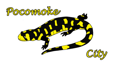
The Salamanders – one of my absolute favorite team names from the league.
Salisbury Indians
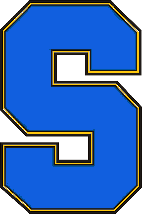
They were actually not an Indians affiliate, but I really wasn’t interested in using Chief Wahoo anyway. So I used a more respectful logo, and colored it with the hues of the city’s hometown company, Perdue.
Parksley Spuds

I couldn’t resist drawing this one, it’s my only real free form drawing here. Of all the teams in the league, I was amazed that Parksley (which was actually a founding league member, around from 1922-1928) actually has a jersey on the internet you can buy. I took my coloring cues from that.
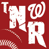
Northampton Red Sox

Down in Cape Charles, VA, the team was named after the county, Northampton. The N is somewhat reminiscent of the college football team’s logo from right across the bay, and way back when the Northampton Red Sox were playing, Navy Football actually won a National Championship.